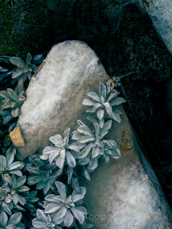
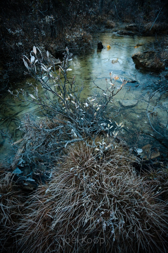
In a lot of ways these photos could not be more different. The top one was taken at Beaverhill Lake, which at this point is a big marshy field in the prairies. The bottom was taken near the Saskatchewan Glacier in the mountains. The top was taken in spring, the bottom one in fall. The top is macro, the bottom is a landscape.
But when I was developing the top one today, my mind immediately went to this bottom photo that I took four years ago. The tones of the images help to group them, but what really strikes me is the similarity of composition. Both are triangles with the base at the bottom of the photo. They both have interesting lines thrusting up at angles through the frame.
When I’m composing an image, I don’t often consciously think about what to call a composition or what photo it will be like. I’m usually trying to balance the elements in the frame once an interesting line catches my eye. After the fact, when I’m looking through my images though, I start to notice themes. In some ways I like this — consistency is good. But I also don’t want to overuse themes and become boring. It’s a constant struggle of evaluation, and I probably overthink it. But it’s something I’ve noticed and thought was kind of interesting.

