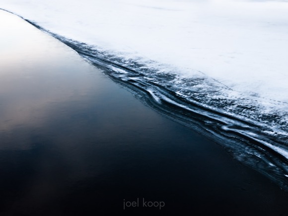
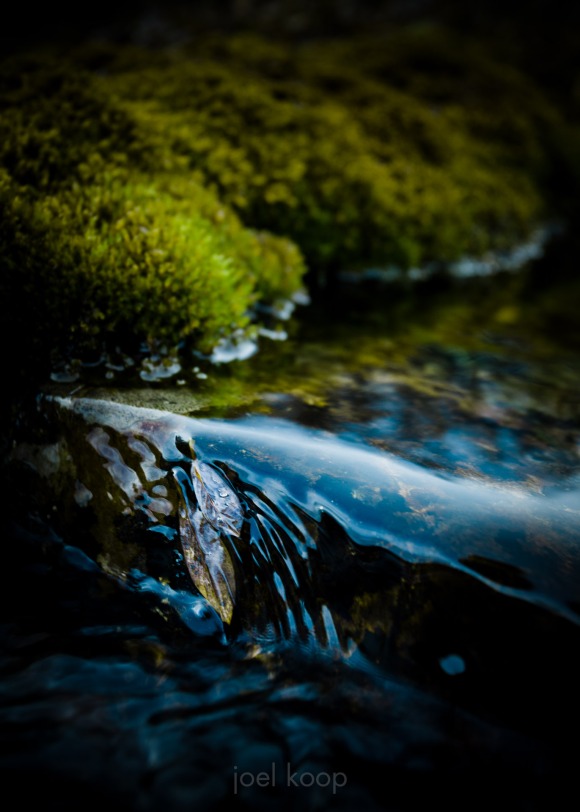
Abstract Ice Edge

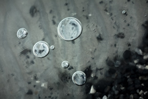
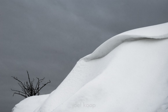
Back from Camrose with a minimalist photo for you. Keeping almost everything outside of the frame of the photo puts much more emphasis on what is there – the tones, the quality of line. And in photography especially it is difficult to keep a composition simple. It is easy for little things to sneak in – the world is a busy and complicated place. It can be a sort of zen exercise to focus on a simple subject and to remove everything else.

This is the Saskatchewan River last winter.

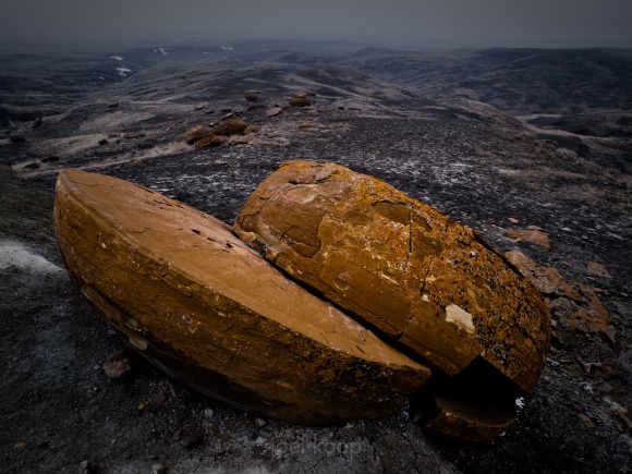
Split Rock at Red Rock Coulee

Today’s pic is a little late. I might even miss a few days over the weekend while I’m at the Camrose Spirits of Christmas craft sale. I’ll have a bunch of prints, cards, and tags for sale there. Also, if you want to see a few new products I’m working on, I’ll have a few of those there too.

And in case you can’t make it to Camrose, I also have prints and cards for sale through this website. I’ve updated the way I do things, so shipping is much less expensive and every print and card you get will be signed (and prints mounted or matted). On the downside, it will take a little longer to fulfill orders. I’m guessing around 1 month, unless I happen to have that print or card already in stock, in which case you should be able to get them in a week or so.

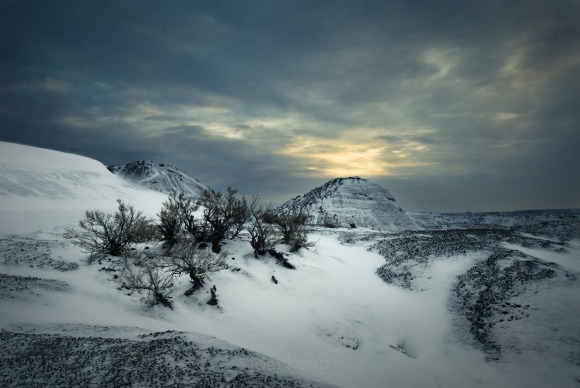
Finally, today’s photo – a cold and snowy early spring evening at Red Rock Coulee in southern Alberta.

Considering Composition

Composition and inspiration are, in my opinion, the core of art photography. Working part time in a camera store, it is easy to get caught up in technical details and gear wankery. Which is important, but art gets left behind because it is harder to talk about, and doesn’t put money in company’s pockets. But I’d like to talk about composition.

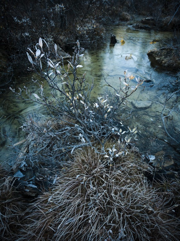
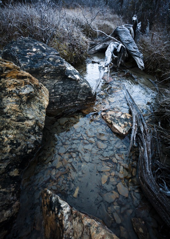
I’m posting two photos today. They were taken just a few minutes apart and they have similar lighting, similar composition, similar subject. In both I used the classic triangle composition (this is something I’m only half conscious of when I’m taking photos) – one with positive space (seems to come forward), one with negative (seems to recede). In a triangle composition there’s a broad base at the bottom coming to a point at the top of the frame.

The top photo was taken first, and when I downloaded the photos it was also the first to jump out at me. I really liked it. Over the last few weeks, my opinion has been shifting. I’ve gained some distance from the memory of taking these photos, and now I’m thinking the second is better. It has a clearer composition with the high contrast edges of the rock and the log, and it has contrast between two sides of the triangle – the log gives a curvy organic line to contrast with the sharp jagged line of the rocks. Both lead the eye to a focal point – the leaf and the stump in the water on the first one, and the log at the top in the second.

In the end I’m sure it’s subjective. Some people will like one better, and some people the other. But it’s fascinating to me, in something as abstract as a nature photo, how much of a consensus there can be on good or bad photos.
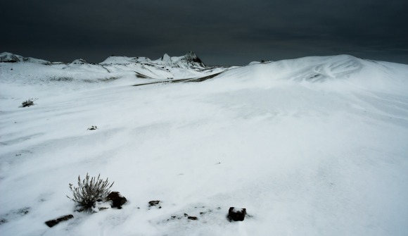
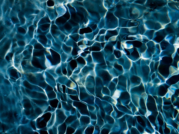
Dinosaur Provincial Park Covered in Snow

Dinosaur Provincial Park is a great place to check out, especially in winter. I went there in the middle of December a couple years ago. After a cold night sleeping in my car, a friendly snowplow driver cleared the way for me. I got there before sunrise and the whole area had just been covered in a fresh dusting of snow the night before. I was the only person there, although there were new cat tracks everywhere. It was a great day! Then on the way home my transmission blew. There’s always something…


Normally I’m not a fan of weird crops and panos. Too often the composition becomes more about the crop than the contents interacting with the frame. Sometimes it’s just that too wide of a lens was used and a boring foreground and sky have to be cropped out. But every once in a while an image benefits from a different crop.

Yeah, this is supposed to be pic of the day, but sometimes I just can’t resist the allure of multiple pictures.