Fireweed

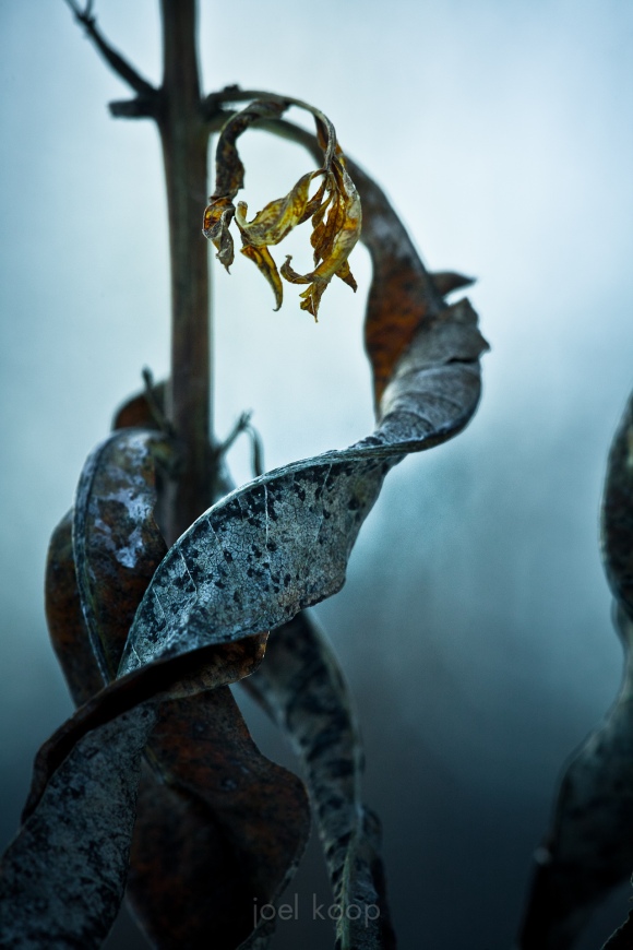
A couple weeks ago I was out at Clifford E Lee Wildlife Sanctuary. It was dreadfully cold and winter depression had set in. I walked around for a while, not really inspired—just trying to soak in enough sun to stay sane. I hardly even looked through my photos when I got back. Today I was going through them and found this:


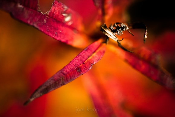
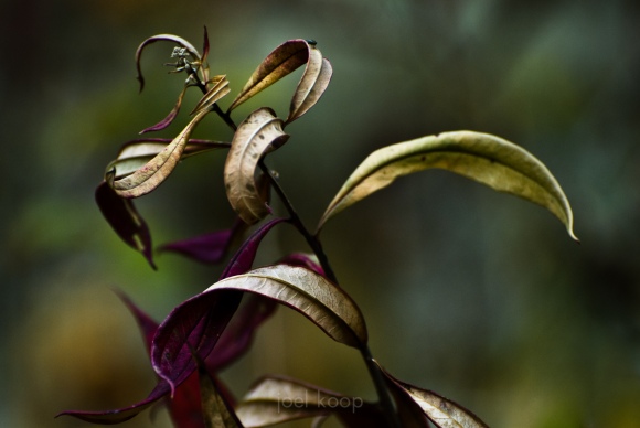
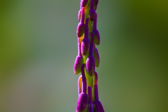
Fireweed (Epilobium angustifolium) has provided me with so much color and so many great curvy lines to work with that I feel compelled to do a bit of a tribute to fireweed.


Inspiration

There are photographs everywhere—online, in coffee shops, in museums, on billboards. That makes it easy to be aware of what photographers and artists are doing. Artists are often inspiration to each other, and I have definitely experienced this in my interactions with artists in all kinds of mediums. Sometimes the inspiration is conscious and sometimes subconscious, but it happens all the time. I want to acknowledge some of the photographers who have inspired me, and this could be a long list. So I’ll mention them as they come up. I already mentioned Darwin Wiggett a few days ago. This photo was inspired by Jonathan Martin-DeMoor, which I guess means we have a cycle of inspiration going. That is awesome, and often when you get new and interesting work happening—when two artists spur each other on.

Just so it’s clear, I’m not talking about copying. This also happens all the time, and I’m not a fan. This is one thing I was worried about going out to Abraham Lake after seeing photos of it. You actually have to work at avoiding taking the same picture as everyone else. Or maybe you have to take it to get past it, I’m not sure yet. But I am never happy to have the same composition I’ve seen before, even if the light or the weather is different. I’m a creative person, and I want to interact with the landscape myself, not just see it through someone else’s eyes.

Sometimes I want to go to the same places I’ve seen photographed when the area looks interesting, but I’m never interested in duplicating someone else’s work. That is how the landscape spoke to them, not me. I want my photography to share my personality.

The X Composition

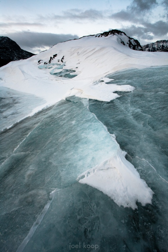
Just a quick photo today—I’ll continue the account of my trip tomorrow. Ice and snow on Abraham Lake.

For the record, I’ve never heard of an X composition, and intuitively it doesn’t seen like it would work to me. But for some reason I like this photo.

Landscape Light 2

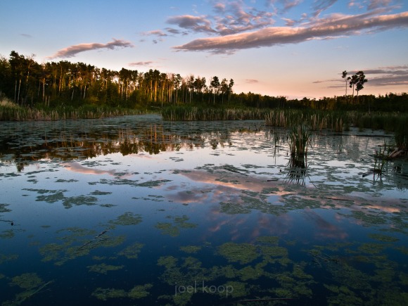
Often sunrises and sunsets are the best light. This light is more unusual, so it adds interest to a scene, as long as the light is not competing with other elements of your composition. I often feel like sunrises or sunsets are bandages though – something to fix an otherwise boring scene. So if you’re taking a photo of a sunrise or sunset, make sure you consider the composition as well, and what makes the foreground interesting.

Taken at sunset in Cooking Lake Rec Area last summer.

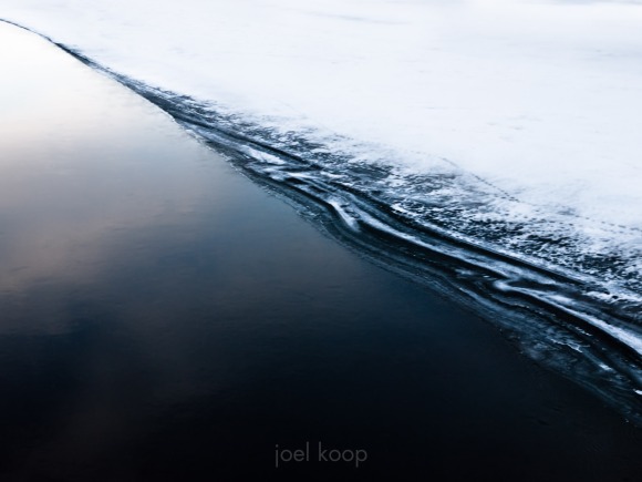
Abstract Ice Edge

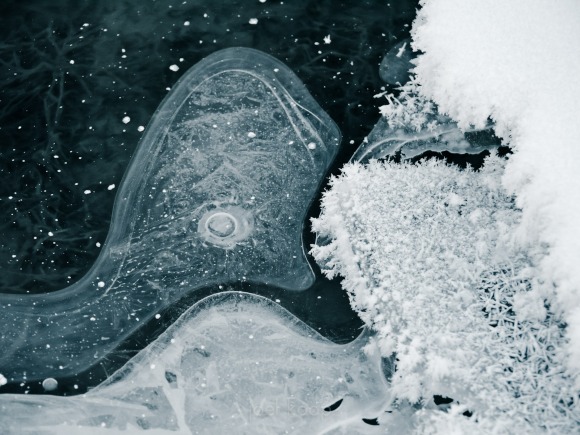
Back from Camrose with a minimalist photo for you. Keeping almost everything outside of the frame of the photo puts much more emphasis on what is there – the tones, the quality of line. And in photography especially it is difficult to keep a composition simple. It is easy for little things to sneak in – the world is a busy and complicated place. It can be a sort of zen exercise to focus on a simple subject and to remove everything else.

This is the Saskatchewan River last winter.

Considering Composition

Composition and inspiration are, in my opinion, the core of art photography. Working part time in a camera store, it is easy to get caught up in technical details and gear wankery. Which is important, but art gets left behind because it is harder to talk about, and doesn’t put money in company’s pockets. But I’d like to talk about composition.

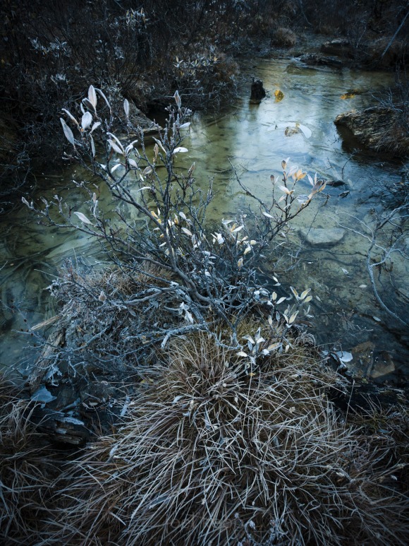
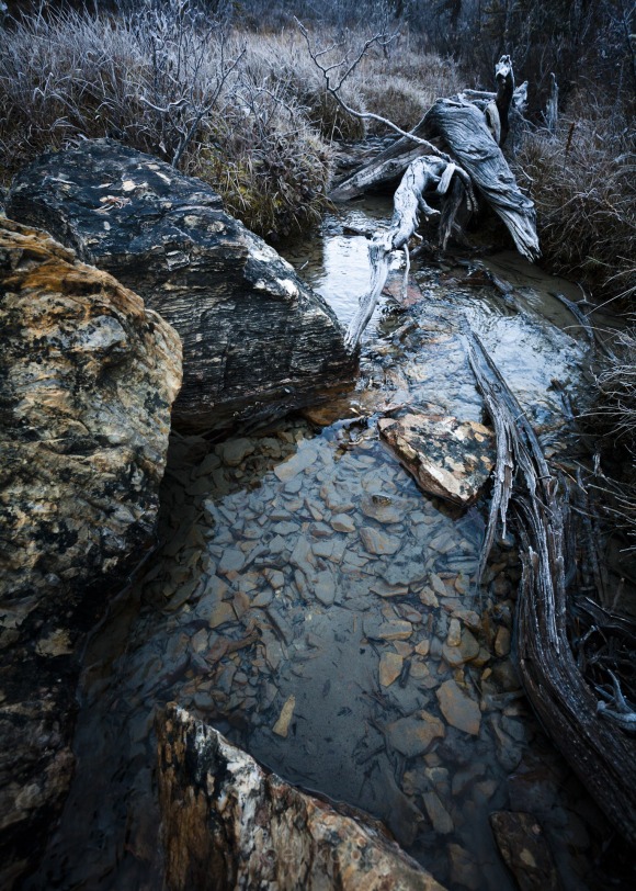
I’m posting two photos today. They were taken just a few minutes apart and they have similar lighting, similar composition, similar subject. In both I used the classic triangle composition (this is something I’m only half conscious of when I’m taking photos) – one with positive space (seems to come forward), one with negative (seems to recede). In a triangle composition there’s a broad base at the bottom coming to a point at the top of the frame.

The top photo was taken first, and when I downloaded the photos it was also the first to jump out at me. I really liked it. Over the last few weeks, my opinion has been shifting. I’ve gained some distance from the memory of taking these photos, and now I’m thinking the second is better. It has a clearer composition with the high contrast edges of the rock and the log, and it has contrast between two sides of the triangle – the log gives a curvy organic line to contrast with the sharp jagged line of the rocks. Both lead the eye to a focal point – the leaf and the stump in the water on the first one, and the log at the top in the second.

In the end I’m sure it’s subjective. Some people will like one better, and some people the other. But it’s fascinating to me, in something as abstract as a nature photo, how much of a consensus there can be on good or bad photos.


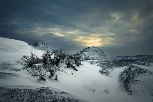
Dinosaur Provincial Park Covered in Snow

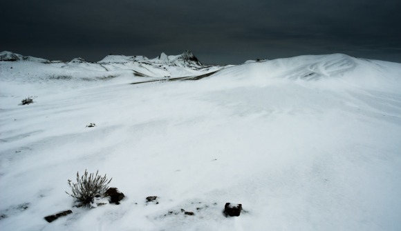
Dinosaur Provincial Park is a great place to check out, especially in winter. I went there in the middle of December a couple years ago. After a cold night sleeping in my car, a friendly snowplow driver cleared the way for me. I got there before sunrise and the whole area had just been covered in a fresh dusting of snow the night before. I was the only person there, although there were new cat tracks everywhere. It was a great day! Then on the way home my transmission blew. There’s always something…


Normally I’m not a fan of weird crops and panos. Too often the composition becomes more about the crop than the contents interacting with the frame. Sometimes it’s just that too wide of a lens was used and a boring foreground and sky have to be cropped out. But every once in a while an image benefits from a different crop.

Yeah, this is supposed to be pic of the day, but sometimes I just can’t resist the allure of multiple pictures.

First in a Series of Self-Critiques


This post is the first in a series of photo critiques I plan on doing with my own pictures. My goals for this are to improve my photography by conscious analysis and to give other photographers ideas for creating better images. I’m sure I’ve missed a lot in my analysis, and I welcome any questions, comments, corrections or additions.

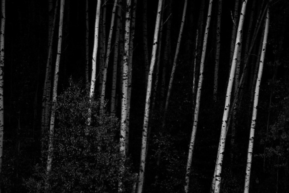
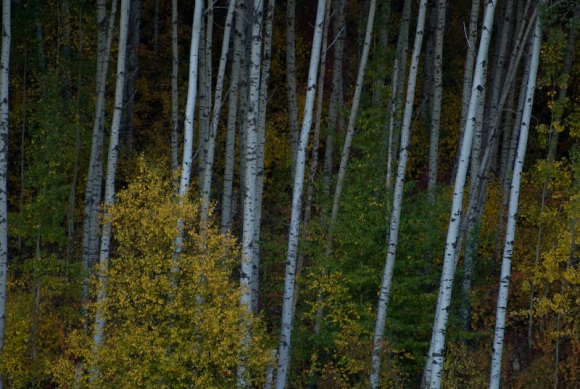
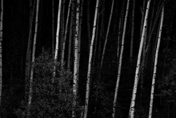
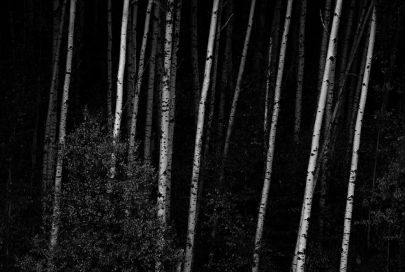
Here is a recent picture of a poplar forest after sunset at Chickakoo Lake. It was taken at a focal length of 300mm at f5.6. The shutter speed was only 1/80 of a second, so I used a tripod and mirror lockup to get a sharp picture. This is the original with only some white balance corrections applied to the raw file:

What works:
My aim is for the photo to be simple and striking, evoking a sense of quiet unknown. The main, almost only, element in the photo is the repeating tree trunks disappearing into the forest. The narrow field of view from the 300mm lens helps crop out distracting elements: the sky, the treetops, the underbrush.

I kept the leafy tree in the bottom left. It does break up the repeating tree trunks, but works to stop some of the strongest lines in the image from dropping off the bottom edge. Instead the viewer’s eye gets briefly trapped in the subtle detail of the leaves before being snapped back to the high contrast tree trunks.

1. Compression – I used a 300mm telephoto lens. One of the effects of a telephoto lens is to compress the foreground and background into a single plane. There is no vanishing point: parallel lines do not converge. This makes the picture look flat – things that are actually separated by a lot of space appear to be right next to each other.
2. Depth – The evening light highlights the first few trunks of the poplar trees. These are very high contrast and grab the eye quickly, even if you just glance at the photo. Deeper into the forest, the trunks are darker, but still visible. This adds a subtlety and depth that can draw the eye in and hold it longer. There’s a sense of mystery as the forest is only partially revealed.

I find it interesting to play with depth through color and contrast in an image which has very little depth from foreshortening. Extreme wide angle is very popular for landscape photographers these days, and it often works very well, but good landscape photos are also possible at telephoto focal lengths and are a little more unusual.

What doesn’t:
I don’t particularly like the original colors in this image. The soft yellows, greens, and pinks take away from the high contrast, mysterious effect. They could be useful for a different goal, but I really like the dark brooding forest of the edited version. So I played with the curves a little bit to add contrast and converted to black and white. I can’t quite decide if the contrast is too strong now. Are there too few details left in the background?

On the left edge of the image is a dimly lit tree trunk beside a large dark area. I find that tree distracting. I may crop out the tree to give the image a little more balance, but it’s too bad because I really like that large dark void.