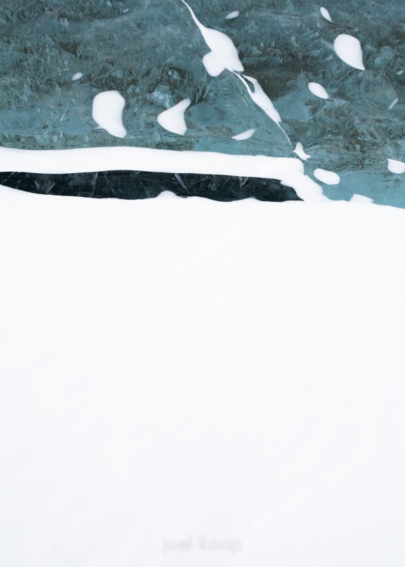
In some ways this is very similar to my previous post. (You may need to click on the photo to see the entire photo more easily) This photo was taken very close to where the last one was on Abraham Lake. They are both abstract photos of nature using very strong design principles. They both play with positive and negative space, but instead of being very organic, this is very angular. The composition is almost entirely based on the rule of thirds — the dark line in the ice is about 1/3rd of the way down and protrudes about 2/3rds of the way into the photo. The ice in the photo covers about 1/3rd of the area, and the snow covers the other 2/3rds. This visual weighting based on the rule of thirds generally works very well, even if the dark and light areas of a photo are not seperated by a straight line (although here they are clearly seperated by a horizontal line). So, while the rule of thirds is almost over-popularized, it is still effective for creating interesting and new compositions.
