Finally, Composition

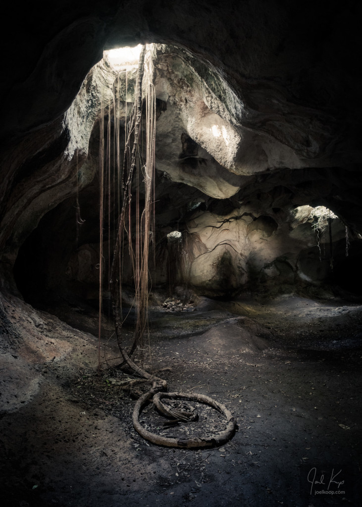
Roots in a Cave in Cuba

It’s been a while since our last composition class, so I’m excited to have one scheduled again! We also have the ever popular “Mastering Your SLR” class coming up pretty quick. The Composition Class is May 8th and the Mastering Your SLR is April 24th. For information or to register visit the Mastering Your SLR page or the Composition page on the St. Albert Photo Classes website.

I took this photo in a cave in Cuba. It was a fascinating experience – partly lit because of the holes in the ceiling but still dark enough to need flashlights or headlamps. There were many little bats chittering away. They seemed to be hanging out in little groups (probably with their families) with one in each group keeping an eye on us to make sure we didn’t bother them.

I chose this photo for the Composition class announcement because it is an interesting example of some of the topics we discuss as a group. It is a good example of leading the viewer’s eye with lines and with strong contrast. It also shows how the contents of a photo are always viewed in relation to the edges. I love talking about this kind of stuff (and much more) with students and it’s always interesting to hear other perspectives on this! While everyone sees different things when they look at a photo there are a remarkable number of similarities in what we see. If you’re interested in composition I hope you can join us!

Subjects and Interest in Wildlife Photography

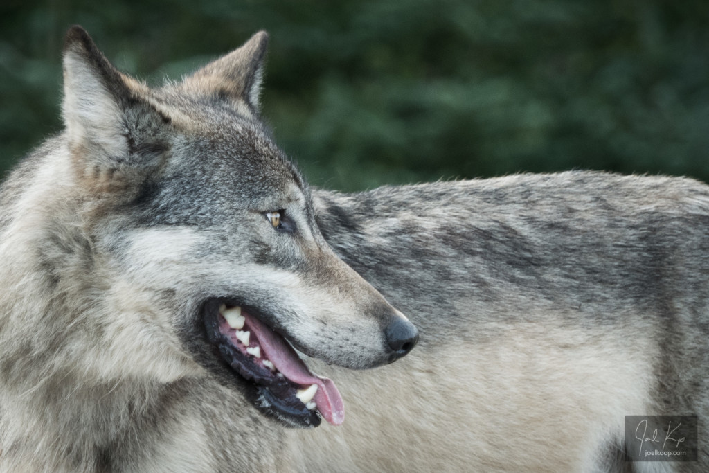
Gray Wolf Jasper National Park

A wolf is one of those reclusive and rare animals that is not often seen around here. So when I got a chance to spend a few minutes with this wolf in Jasper, I was very excited. It was watchful and curious, but most of all it was very purposeful – it had somewhere to be.

I’ve debated posting this picture for a while. I think I’m a fairly tough critic of my own photos, and I don’t think this is an amazing photo. I think it’s okay. And I don’t like posting okay photos. I’d like to be known as a really good photographer, not an okay photographer. But the kid in me says “IT’S A WOLF!!! I SAW A WOLF!!!!” And that’s hard to discount.

While an interesting subject helps a photo, I don’t think it can make a photo on its own. I still think it has to have some appealing aesthetic value beyond an interesting subject to be a good photo. This creates a bit of a conundrum for the wildlife photographer in me. While I have taken thousands of wildlife photos, I generally have very little control over the backgrounds, the lighting, and the locations of the animals. And I don’t want that control. I want the animals to go about their lives undisturbed by me. I don’t want to force them into new places and to do things that are uncomfortable for them. That kind of behaviour can threaten their lives and make them less likely to reproduce.

Every once in a while, circumstances will align just right (and knowledge of animal behaviour can make this more likely), and I’ll be able to get a good wildlife photo. The more I’m out in the woods, the more this will happen. But for me there is beauty all around – both flora and fauna, and I’m content being a photographer of opportunity. I get to share incredible landscapes with these amazing animals, and I’m thankful for the odd encounter, whether or not I get an good photo.

Mossy Stream

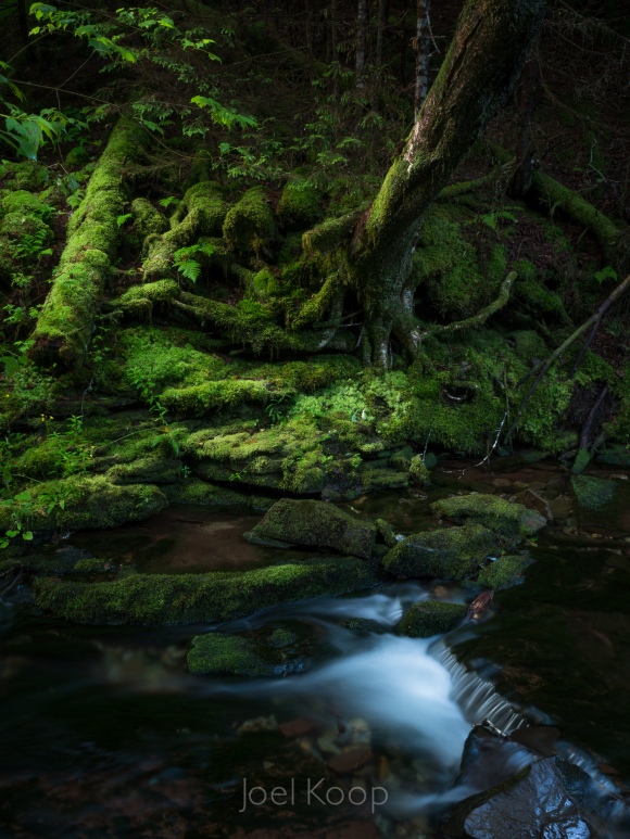
I got back from my first ever trip to the east coast a few days ago! I already want to go back, but catching up on real life is important too. I’m not finished going through the photos yet, but this one stood out to me. I’ve always loved the fairy-tale richness of mosses, mushrooms, and small streams. They’re the backdrop for a thousand story lines, and at the same time a peaceful place where nothing needs to happen.

Mossy stream early in the morning in Fundy National Park.
f11, 6 seconds

Composition Consistency

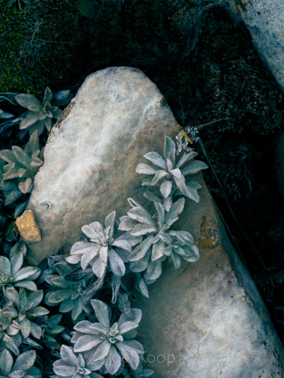
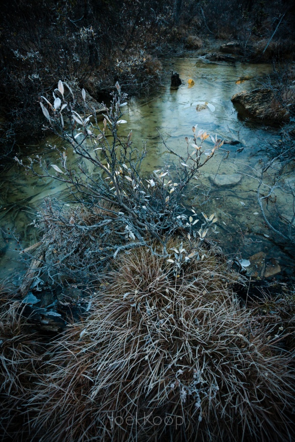
In a lot of ways these photos could not be more different. The top one was taken at Beaverhill Lake, which at this point is a big marshy field in the prairies. The bottom was taken near the Saskatchewan Glacier in the mountains. The top was taken in spring, the bottom one in fall. The top is macro, the bottom is a landscape.

But when I was developing the top one today, my mind immediately went to this bottom photo that I took four years ago. The tones of the images help to group them, but what really strikes me is the similarity of composition. Both are triangles with the base at the bottom of the photo. They both have interesting lines thrusting up at angles through the frame.

When I’m composing an image, I don’t often consciously think about what to call a composition or what photo it will be like. I’m usually trying to balance the elements in the frame once an interesting line catches my eye. After the fact, when I’m looking through my images though, I start to notice themes. In some ways I like this — consistency is good. But I also don’t want to overuse themes and become boring. It’s a constant struggle of evaluation, and I probably overthink it. But it’s something I’ve noticed and thought was kind of interesting.

Spring – A Great Time to Learn Composition

I’ve been enjoying the warmer weather lately and, despite the lack of ice to photograph, I’ve enjoyed coming up with compositions of what is available. Being able to go out in a t-shirt is just a bonus.

On June 25th from 6:30 – 8:30pm in St. Albert, I’ll be teaching a composition class. This is open to anyone — whether you only use your cell phone or you regularly haul around multiple SLRs. The class will cover a wide variety of techniques for composition and should be enlightening and fun. Although I mostly show nature photography professionally, I’ll have examples of everything from studio sessions and weddings to wildlife and of course lots of nature as well. So if you want a painless way to drastically improve your photos, come join me! You can sign up at St. Albert Photo Classes. You’ll notice I’m also teaching a “Mastering Your SLR” course, which is very helpful for the technical side of photography, but composition is my favorite subject—learning to compose thoughtfully is an easy way for anyone to set their photos apart.

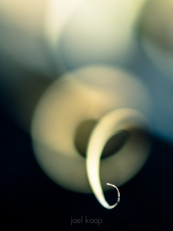
The photo is a grass curl over a burnt log near Landslide Lake in a forest fire affected area.
90mm, f2.5, 1/1000 of a second

Thoughts on Composition and Waterfalls

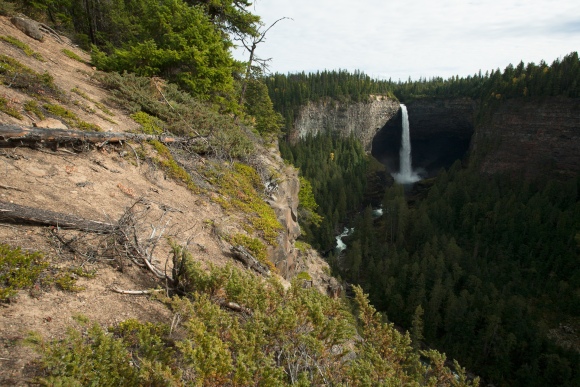
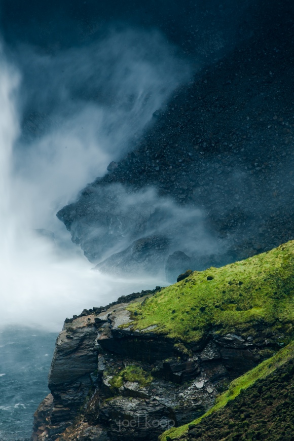
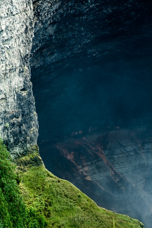
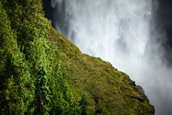
About a month ago I visited Helmcken Falls for the first time. It was a quick stop on a long trip, so it was in the middle of the day and the light was mediocre at best. But the falls are spectacular! The fairly large Murtle River plunges almost 500 feet in and earth-shaking display of watery power. So how do you communicate this sense of power and beauty in a photo? Most people will (including me) take a photo something like this:

1.

This is not a horrible picture, but it’s not a great one. The falls are small and far away. You get some context, but none of it is very interesting. Also, the sky is very bright and the canyon is very dark. Some people would suggest using some HDR technique to deal with this, but I like to deal with these things a little differently.

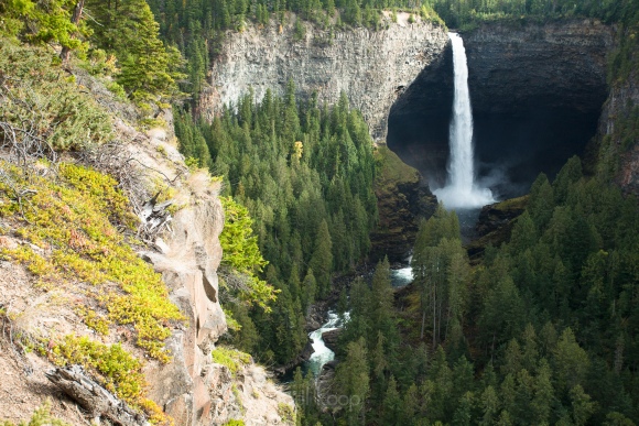
2.

There, now we’ve cut out the sky, and the exposure is a little better. There are more details in the trees in the canyon and we’ve zoomed in a bit on the falls, so they’re not lost in the picture. But this is still just an average, boring picture of a waterfall. There are no clear lines in the composition, and besides looking at the waterfall our eyes have nowhere to go. What if we zoom in a little more?

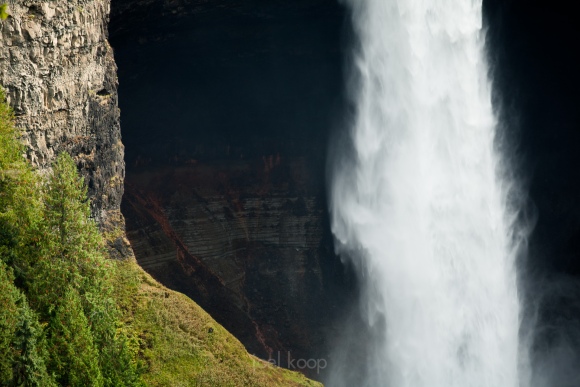
3.

Now we’re limited to just a couple compositional elements — the waterfall and the cliff beside it. Our eyes have two interesting lines to jump between, and some interesting detail in the dark area in the middle. You can also see the power of the water more clearly, with both the piece-y water falling down and a clear view of the canyon it has carved out. But I feel like the black part on the right is not very interesting and is occasionally pulling the eye over to that side of the photo. So let’s get rid of it.

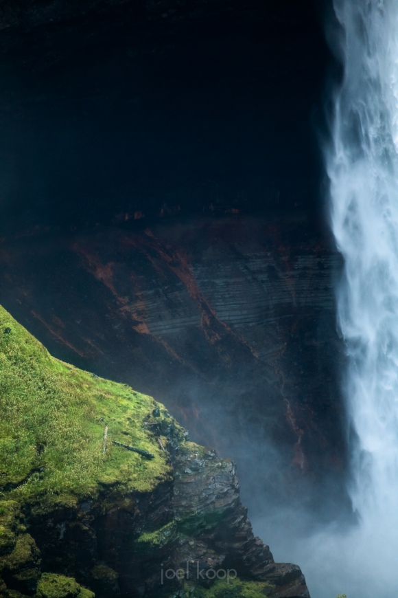
4.

Now the focus is on the negative space, which is actually really interesting. The reds and greys of the canyon are framed by the waterfall and the grassy rocks on the left. I think this is actually pretty interesting and shows off the falls a lot better than the first photo.

But because I like to explore with compositions, I tried some other framings of the falls.

5.

I find leaving the falls completely out of the photo can yield even more interesting results that a photo of the falls itself. You still get a sense of the power here, possibly even more, by focusing on the effects of the subject — not the subject itself.

6.

7.

Of course there are many other ways of dealing with boring photos. You could come here late in the evening with the sunset illuminating the falls in a warm glow. You could come get the sunrise over the falls and use multiple exposures to balance the bright sky with a dark foreground. You could come at night and get stars over a smoothed-out long exposure waterfall. But this is one way of dealing with boring light and still getting interesting photos.
Context

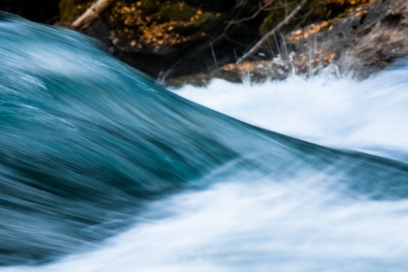
I often get wrapped up in a composition. I get so focused on the lines in my subject that the surroundings fade away. Sometimes this focus helps, but sometimes I ignore the fact that including some of the surroundings will give the viewer a context for the main subject. This is still a very tightly cropped image (taken at 300mm), but I’ve included the shore in the background, and I think it makes the photo. It tells the viewer the time of year (fall), the place (rocky river), and the fall colors compliment the blue-green water. The violence of the water is still obviously the main subject and the part that is in focus, but now the eye is often pulled between the water and the shore.

This photo was taken while lying down near the Clearwater River, BC. 300mm, f18, 1/15 of a second.

Drawing in Space

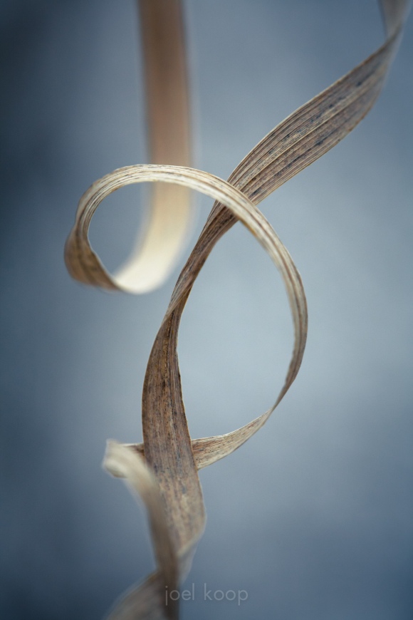
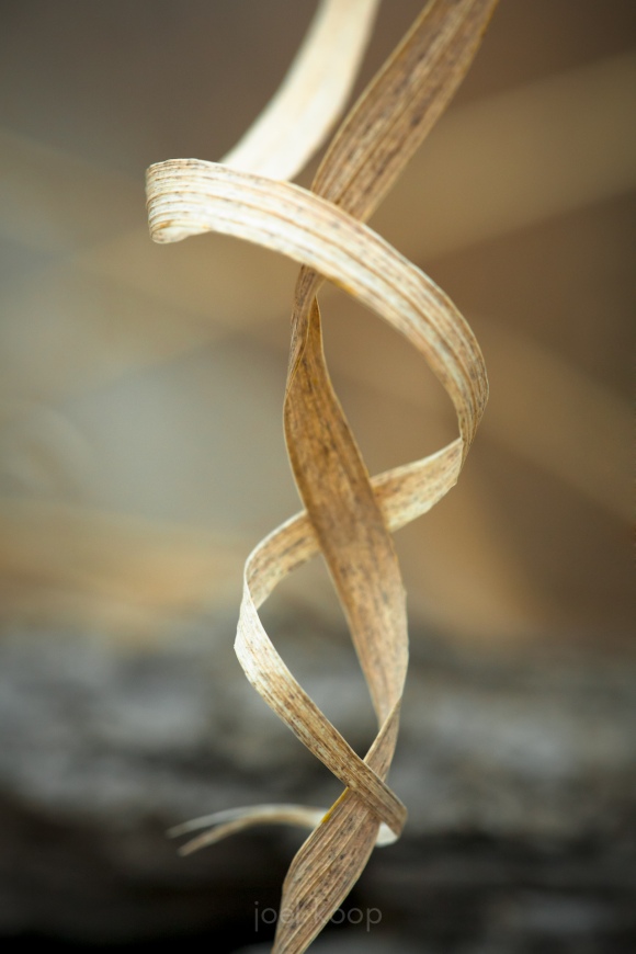
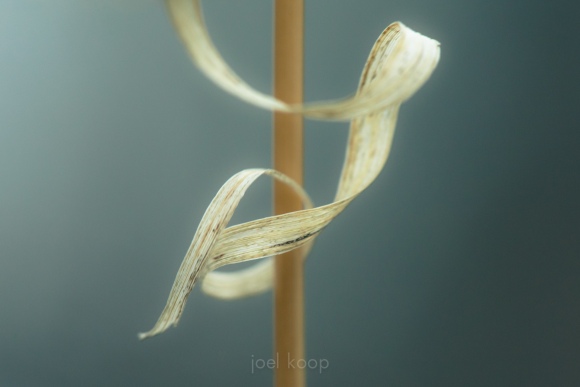
In my design studies at university, we had a fascinating sculpture assignment called “Drawing in Space”. We used strips and small blocks of wood to create a sculpture with interesting lines when viewed from any angle. Both the lines and the negative space they defined were equally important. I really enjoyed framing spaces and cutting into volumes of space, and that is something that I don’t get to do quite as much with photography. But when opportunities present themselves, as they did this last week, I get lost in the creating. I’m not sure how long I spent in this particular treasure trove of grass curls. The shallow depth of field I’ve used here really adds to both the ethereal-ness and the depth of the photo, letting you almost feel the space around the grass.


All taken with my 5d, 150mm macro, f6.3, 1/200 – 1/640 of a second.
Taken on the Beaver Pond Trail in Elk Island National Park.

If you’re still reading and interested, I’ll just write a quick note about composition. In the last two photos I’ve done something that is generally disapproved of in standard compositions – there is a strong line running vertically through the frame (even directly in the middle of the frame! the horror). In these cases I think it works as an unusual visual device to emphasize the depth of the photo. If the grass curls did not wrap around the vertical line it would not work.

Visual Design in Abstract Nature Photography

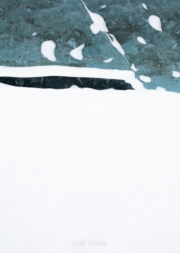
In some ways this is very similar to my previous post. (You may need to click on the photo to see the entire photo more easily) This photo was taken very close to where the last one was on Abraham Lake. They are both abstract photos of nature using very strong design principles. They both play with positive and negative space, but instead of being very organic, this is very angular. The composition is almost entirely based on the rule of thirds — the dark line in the ice is about 1/3rd of the way down and protrudes about 2/3rds of the way into the photo. The ice in the photo covers about 1/3rd of the area, and the snow covers the other 2/3rds. This visual weighting based on the rule of thirds generally works very well, even if the dark and light areas of a photo are not seperated by a straight line (although here they are clearly seperated by a horizontal line). So, while the rule of thirds is almost over-popularized, it is still effective for creating interesting and new compositions.

Abstract Geometric Nature Photography

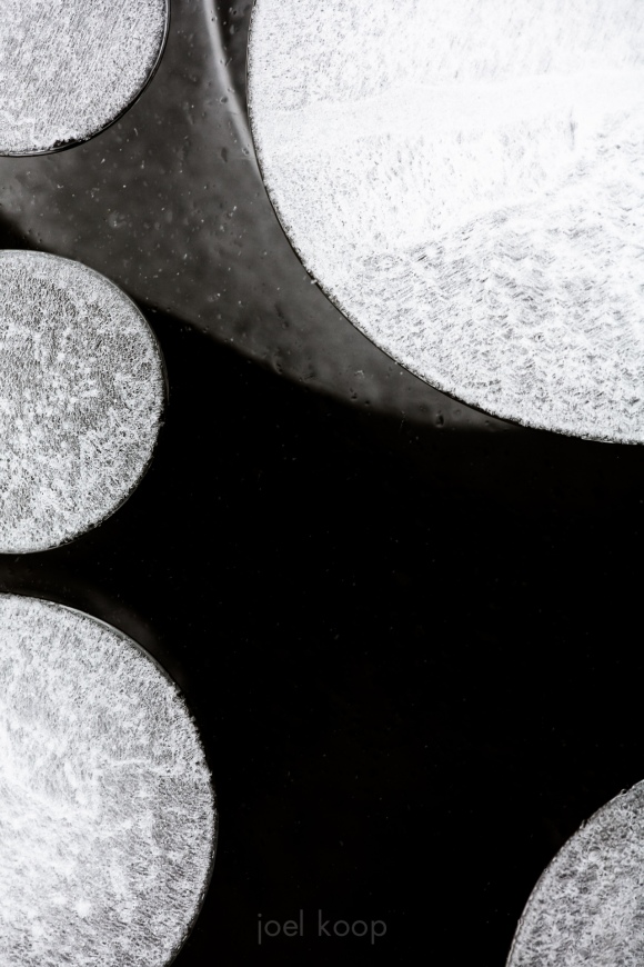
Finally starting to make my way through photos from the last few trips. This is from Abraham Lake, which has been extensively photographed by many Alberta landscape photographers. It’s easy to come up with the standard compositions here, but it’s also easy to come up with new stuff. There’s just so much variety in the ice, water and rocks. These are methane bubbles from decomposing organic matter. The bubbles form in the ice as the water freezes layer by layer.

In a shot like this, composition is everything. It has to balance the visual weight of light and dark. The three smaller bubbles on the left have to balance with the two larger bubbles on the right. The negative space and positive space both have to be interesting — here the textures in the ice and bubbles add visual interest. And because it’s nature and you can never control it completely, there will always be random elements to deal with. In this picture, the shadow of something deeper lies near the top of the frame. I like the visual reminder that in photography, art is created between the artist and the subject: you never have complete control.